
This month, we went behind the scenes with Daisy Hirst, author and illustrator of our picture book of the month, The Girl with a Parrot on her Head. In this exclusive blog post for Picture Book Party, Daisy gives us a sneak peek inside her sketch book and tells us how she developed the story and artwork for her debut picture book...
Making the story
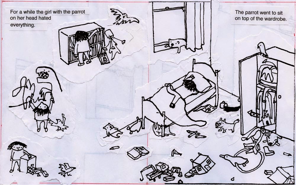
The Girl with the Parrot on her Head began as two unrelated sketchbook doodles: Isabel
first appeared (among other people with birds on their heads) in 2010,

and her cardboard box
“system” is even older.

My drawings are very
small (Isabel there is 1.6cm high) so it takes me about a year to fill up an A5
sketchbook. In 2011, when I was almost at the end of the bird-heads sketchbook,
and halfway through an MA in Children’s Book Illustration, the girl with the
parrot on her head came back, this time with words, and from then on the words
and pictures developed together.

This phrase stuck with
me, and suggested the whole story: apart from the tense it hasn’t changed since
this first edit – even though people did sometimes suggest it was too negative,
and many other things have changed (for instance, Isabel didn’t have a name
until I started working with Walker in 2013 – she was always ‘the girl with the
parrot on her head’). I suppose I hung on to it because I want to write
honestly and take children’s experiences seriously – Isabel gets upset and
angry and isn’t always ‘nice’ (as I certainly wasn’t), and that’s actually
okay.

After doodling ideas
for the story, I developed it through storyboards and mini dummy books. I had
lots of help from the incredible tutors at Cambridge School of Art, who are all
practicing illustrators, and from friends and family too.

Making the pictures
At the same time,
before the story made much sense, I started making the pictures. The
illustrations in The Girl with the Parrot
on her Head are all silkscreen prints – a technique I began to learn
through making this book. Before that, I had used pen and ink with coloured inks,
but I wanted to find a technique which would enable me to make bigger, bolder
images, and experiment with using limited colour, whilst keeping my drawing
free and scribbly. I do my best drawing when I can draw tiny things, and when
I’m not worried about getting it right. So now I draw each picture many times,
enlarge all the best bits and stick them together to make the final composition
– which is what I base the screenprint on.
Screenprinting is a
way of building up a picture one colour at a time: for each colour you make a
stencil on fabric stretched over a frame (the silkscreen), and then you squish
ink through it using a tool called a squeegee. I sometimes find it helps, as you
do the squeegeeing, to say “SQUEEEEEE!”
Here is the picture of
Isabel and Simon in the pond, with four colours printed. In the background you
can see the next stencil waiting to be printed (in green) on top.

And here is my screenprinting
set-up with another partly-completed print.

One of the hardest
things when you start screenprinting is registration: printing each stencil in
exactly the right place on top of the other colours. I’ve got much better at
this over the years, but still I often get it wrong – and actually I like a bit
of mis-registration, interesting accidents and mess. In fact, I sometimes think
my prints are getting too neat and I might have to try something new that I’d
be worse at. However, I never meant it to go this wrong:

Finding a publisher
Perhaps because of the
way this story evolved from disparate images and phrases, in a quite surreal
and associative way, it did not – at least at first – go down very well with
publishers. It was ‘too strange’ or ‘too specialised’ or it just did not make
sense. It’s easy now to squash that period into a sentence and forget it, but
it was very difficult at the time: of all the projects I had to offer, this was
the one I felt the strongest connection to, its very strangeness was the thing
I wanted to pursue – but it was also the project that seemed least likely to be
published.

So I was surprised (and
extremely pleased) when Walker decided they wanted to develop The Girl with the Parrot on her Head
with me. That was the beginning of about another year’s work, of reworking and
then finishing the book with my brilliant editor and designer. To be fair to
the other publishers, it didn’t quite make sense as it was – there were lots of
abrupt transitions and squished bits, and a confusing part about playing
pirates – so I’m lucky Walker thought it worth fixing.
Most of the changes
were to make things clearer or improve the pacing of the story. One wonderful
thing was that we were allowed to expand the book to 40 pages from the standard
32 – so we got four extra double-page spreads to play with. Two of these went
on Isabel’s friend Simon, who I’d tried to introduce and eject within one
spread: here’s one of three final Simon spreads.

This bit of the
process was often difficult – every word and every image had to be scrutinised
and justified, perfected or cut, and agreed by all of us. It was also extremely
interesting: I learnt so much about stories, books and design, and I also
learnt about this particular story. When I had to justify things I wanted to
keep, I had to try and figure out why these (often instinctive, inarticulate) things
made sense and mattered to me. I miss some bits we cut or changed, but I think
it’s a stronger book now, and I couldn’t be happier with the design and
production. It is a strange and magic thing to have your book arrive in the
post.


Get hold of your copy of The Girl with a Parrot on her Head at your local bookseller.
Join in the fun and have a go at making your very own animal headbands with this free activity sheet.